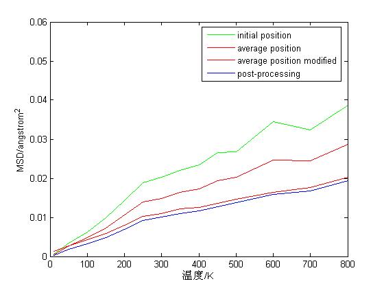
Thanks for sharing. The graph labeled “average position modified” is what is now in LAMMPS. If I understand correctly, it matches your post-processing analysis to high accuracy. You shifted the red graph up by about 0.001 to make it more visible, otherwise red and blue would lie right on top of each other.


