I would like to ask whether, when generating a phase diagram for a given material, it is possible to highlight the corresponding point (on the phase diagram image) in a manner that distinguishes it from the other points (for example, by using a different color or another shape instead of the circle and diamond symbols).
I believe implementing such a feature for both 2D and 3D plot styles would be very useful. In addition, is it possible to make the tooltip that appears when hovering over a structure remain visible (or “stick”) so that it can be included when exporting the image?
Finally, could you please advise on how to properly export a phase diagram as an image? At the moment, I am taking screenshots, as I cannot seem to find a built-in feature for saving or exporting.
Any guidance on these points would be greatly appreciated.
Just to clarify my first question : I mean when generating a phase diagram for a chemical system (say Na-Cl) I want to highlight a specific material (say for example mp-1077015) to be in a different symbol or color.
Hi @Ballmer the plots are just generated with matplotlib or plotly, depending on how they’re accessed. You can use any feature that is available to those python packages to change the label style of a point, or export an image
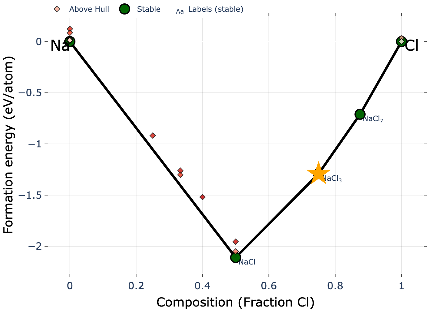
Here’s an example to get you started. We’ll use the python API client and the Na-Cl chemical system to highlight one entry with an orange star:
from mp_api.client import MPRester
from pymatgen.analysis.phase_diagram import PhaseDiagram
import plotly.graph_objects as pgo

# First retrieve entries in chemical system
with MPRester() as mpr:
    entries = mpr.get_entries_in_chemsys("Na-Cl")

# Construct the phase diagram
pd = PhaseDiagram(entries)

# Isolate one particular entry and get its 2D cartesian coordinates
entry = [e for e in entries if e.entry_id == "mp-1189265-GGA"][0]
x = entry.composition["Cl"]/sum(entry.composition.values())
y = pd.get_form_energy_per_atom(entry)
fig = pd.get_plot()

# Now plot the particular entry with plotly and a custom marker
fig.add_trace(
    pgo.Scatter(
        x=[x],
        y=[y],
        marker={
            "color": "orange",
            "size": 30,
            "symbol": "star"
        },
        showlegend=False
    )
)

# just some basic stylistic changes:
aspect = 4/3
w = 1000
fig.update_layout(
    plot_bgcolor="white",
    paper_bgcolor="white",
    height = w/aspect,
    width = w
)
To save this, you would do something like: fig.write_image("Na-Cl_pd.png",scale=2):
Fantastic! This is exactly what I was looking for—thank you very much, dear @Aaron_Kaplan
Regarding the tooltip that appears when hovering over a material, is it possible to make it remain visible (stick) for exporting purposes?
One last question, please: using the code you provided, is it possible to apply an energy cutoff such that only structures with an below this threshold are plotted and visible on the phase diagram?
Regarding the tooltip that appears when hovering over a material, is it possible to make it remain visible (stick) for exporting purposes?
You can do this with annotations in matplotlib or plotly, or just visualize in jupyter, hover over a point, and then screenshot
One last question, please: using the code you provided, is it possible to apply an energy cutoff such that only structures with an below this threshold are plotted and visible on the phase diagram?
Take a look at the show_unstable kwarg for the plotter in pymatgen